Saturday, November 28, 2009

A Double Portion of Boardwalk Foods

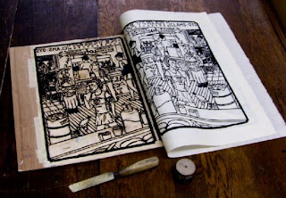
As I expected, it didn't take long to finish off the coloring of the 3rd proof of the boardwalk food print. There are minor differences between the two, with this last one probably the best overall, but both are good enough to exhibit if I ever have a need to have it on two different walls at the same time.

I have another block ready to go, surfaced and outlined, so as soon as I can work out the preliminary composition for the next one, I can start the block drawing. Maybe as soon as next weekend.

Thursday, November 26, 2009

Happy Thanksgiving from Studio Arrabbiata

With a bit of help from Wayne Thiebaud.

Tuesday, November 24, 2009

Still On The Boardwalk

I put in a few more hours on the 3rd proof of the Boardwalk Food print today, finishing all but some of the grays and a few incidental details, plus anything else I missed or need to fix. Didn't take a new photo, but if you want to get a good idea of where it's at now, you can see a very similar state of the print right here. About a half hour of work should finish it up.

Arrabbiata Internazionale

Earlier this month we held a gubernatorial election here in New Jersey (an odd off-year schedule we share with Virginia) and in the days leading up to election day I was bombarded with recorded political (running about 5 to 1 Republican) message phone calls, sometimes 3 or 4 per hour. So by Election Day I was getting hesitant to answer my phone. But answer it I did that day and found Eileen Foti on the other end. If you're a printmaker in NJ, you probably know who she is. If you live outside the U.S. you may know her as well, since she is very active internationally. Eileen has been a fan of my work for many years and our paths cross now and then. The purpose of the call was to invite me to participate in an international collaborative print project. Print artists from around the world (Eileen's group are all from PCNJ) will be producing postcard sized art, starting a piece and then mailing the card to a randomly chosen collaborator, who will add to the card to finish it. Meanwhile the other artist will also start one and mail it to the first artist to finish, so each pair will end up with 2 cards. The cards will eventually be collected in one central location and possibly exhibited at the next Tallinn Print Triennial in Estonia, among other places around the world.

About a week later she sent the guidelines. The theme is "For Love Not Money", which can translate directly to the idea of a labor of love, but we are told the range of related concepts can include things like desire, dedication, duty, family, love, lust, etc. The card must be exactly 5.8" by 8.3", to meet some international standard. The art must include a print process. First part must be mailed by the end of next January, the second part by next April.

And now we have our list of collaborating artists. Some of the nations represented in the PCNJ partners are England, Wales, Spain, South Korea, India, and Estonia. Several, including me, will be working with artists from the Republic of Mauritius. If you are unfamiliar with this place, on the map above it's one of the tiny islands above the letter "D" in "Indian". It's small, in area about the same size as my home area of Monmouth County and adjoining Middlesex County, with about the same population. The island was know to sailors for centuries, first officially settled by the Dutch, then later the French, who later ceded it to England, before achieving independence in the 1960's. It's also known as the only indiginous home of the Dodo bird, which was extinct within a century of European colonization. (which also means that when Porky Pig was looking in "Darkest Africa" for the last Dodo in the legendary shorts "Porky in Wackyland/Dough For the Do-Do" he was about 3000 miles away from the only place it naturally lived)

At this moment I have no idea what I'm going to do with the card I'm starting, but I have more than two months to get it done, so I'm not worried. Whatever I come up with, you'll see it here.

Monday, November 23, 2009

Still More Boardwalk Food


A few more hours in the Studio this afternoon, a bunch more colors on the 3rd proof. Skin, hair, more yellows and browns, as well as oranges and reds. This process goes a lot more quickly when you know exactly what goes where. One more session should finish this one.

Saturday, November 21, 2009

More Boardwalk Food

I got up to the Studio for a few hours this afternoon. I had planned to spend the whole time coloring the 3rd copy of the Boardwalk Food print, but looking at it I realized I still needed to print the "zeppole" on the signboard. I made a few more cuts to the small linoleum piece that contains the word, inked it, and printed it in its place. Looks good. Used water-based ink, to save time and so that it would dry quickly. Meanwhile, I used watercolor in other parts of the print, putting in all the pale yellow and light ochre color. I could have gone on to a third color, but I wanted to leave time for a quick trip to Asbury to check out a new gallery show, and still get down to Belmar for the Small Treasures reception. A couple of more sessions next week will finish this copy off and I can officially move on to the next project.

Wednesday, November 18, 2009

Getting My Hands Dirty


It's been one of those days when I just can't quite get my hands clean. First I helped two classes worth of students print their collagraph projects, and by the end of the the day I had a residue of black ink on many of my fingers. I was home just long enough to have a quick bowl of spaghetti all'arrabbiata , then up to Belmar for the latest meeting of the figure group. (saw my two framed Small Treasures pieces hanging up) When the whole ceiling was removed as part of the new roof project, an improved lighting system was installed in the back room. A big improvement. With the compressed charcoal I favor for this purpose, my hands quickly got much dirtier. Did three 30 minute drawings, all of which had some merit. The somewhat expressionistic one above was my last of the night, and probably my favorite. The model liked this one, too.

Tuesday, November 17, 2009

Art At Bargain Prices


Exchanged e-mails with the current president of the BAC over the past 24 hours. I had thought that the Small Treasures show was being hung Thursday, but he told me it will be tomorrow afternoon, which meant that I had to get my framed pieces there by tonight. The ink was dry enough, so I put in a few hours coloring the two prints shown above, from yesterday's printing session. On the left is a small piece of my A History of Art print, in this case a fairly straight copy of a print from Frans Masereel's novel The City. (the relatively light areas on the right and bottom are pieces of two other parts of the the tower- the Piranesi inspired prison and the reclaimed gallery space) On the right is the middle portion of SS ZACHARY AND ELIZABETH, a recent print from my Everyman series. I found some cheap frames in the basement (both around 8"x10") , cut mats, and put them all together. Got them up to Belmar in the evening, so they should be on the walls by Saturday's opening.

Monday, November 16, 2009

Boardwalk Food Seconds

Took a ride around the area on some errands this afternoon. One of them took me to a local home center. I wasn't particularly looking for new lauan plywood, but I checked the supply while I was in there and found a beautiful piece, too good to pass up. It will find a use in some future project. From there I went to the Studio to do some printing. I made a few quick adjustments to the most recent block, including cleaning up some spots that unintentionally picked up a little ink last time. (might not print, but why not get rid of them while I had my gouge out?) I pulled another copy of the food print on okawara, as seen above. Maybe next week I'll color it to match the one I finished yesterday.

I also made a few small prints for possible inclusion in the upcoming BAC show. The idea in this case was influenced by Molly. Now and then she will do a traditional print, but a lot of her work comes from small images that she prints in many forms and combines in collages and mixed media pieces. I haven't done any recent small inexpensive works, but I thought I could repurpose something already done. I inked and printed small fragments of a few older large blocks, making little uneditioned prints. (sort of like what I did to make a contribution to a silent auction over the summer) I'll color them in a few days, and if I can get them into some cheap frames in time, they can be part of my contribution to the Small Treasures show.

Sunday, November 15, 2009

Boardwalk Food part 32- finished

This afternoon I dealt with the few remaining uncolored areas of this proof. Mostly it was grays- the foreground grill, the pizza ovens and ice cream machines, and the gulls. An assortment of colors were used in spots here and there, including reapplying the same color in a few spots to deepen the chosen hue. As far as I can see, everything is now accounted for, so unless I change my mind about something here over the next few days, I'm going to say this print is finished. The colors definitely work better in this one compared to the first proof. I still need to make one more copy on okawara, but first I need to clean up a few spots on the block- shaving a splinter here and there to clarify several shapes before I pull the next print, so I put that off until next time. Meanwhile, I need to start giving serious thought to the next print in the series.

Saturday, November 14, 2009

Boardwalk Food part 31


In the early afternoon I set out travelling north, stopping first in Belmar. Today was the intake day for the latest Small Treasures show at the Boatworks, our first exhibition since the repairs that kept us closed down since the end of September. Despite the nor'easter that passed through over the past few days everything inside was dry, so I guess the new roof is a success.
I left there and continued up to the Studio. Still a little light rain out there today, but the worst of the storm is over and I was able to safely move the proof in progress and all my watercolor stuff back up there. I started with some pinks, then moved into cool colors- all the blues and greens. Makes a big difference. What remains is all the grays, and a few things I still haven't decided on yet (the pretzel kid's shirt, the various trash in and around the barrel), plus any spots that I may have missed. One more session should do it. Then I'll pull another proof on okawara to color, and start thinking about the next print in the series.

Friday, November 13, 2009

Boardwalk Food part 30

With the remnants of a hurricane bearing down on the Northeast, after yesterday's coloring session at the Studio I brought home the proof and all my watercolor stuff in case the weather kept me in. Today's weather was pretty miserable, not that my schedule would have allowed me to go up to Ocean Grove. But having all the stuff in the house meant that I could put in a few hours before and after work. Today it was more browns, yellows, oranges, and reds, including skin and hair. Ready to move on to the cool colors next.

My Life on the Small Screen


This morning I caught up with some tv shows that I had taped last night, among them the NBC comedy Parks and Recreation, which has become a solid part of that Thursday comedy block. The plot of last night's episode involved the various government departments in the small fictional Indiana town where the show is set competing to design a new mural for the town hall. (the old mural is a WPA era painting filled with violent and racist images and frequently vandalized because of it) The various employees of the Parks and Rec department come up with ideas for a new mural, then debate and vote on which will be the one they submit. None of the ideas are any good (my favorite was from April the college intern- involving such items as rats, a video screen showing a continuous loop of knee surgery, and a human sized hamster wheel complete with a fat man screaming and eating raw beef), and no one will support anyone else's proposal. They decide to compromise, taking a little piece of everyone's and submitting the odd combined image. In the end the town decides they can't afford to hire a muralist to paint a new mural and will just maintain the old one.

Many aspects of the episode reminded me of my own experiences with creating public murals in recent years. Back in 2007 we decided that the long blank walls of Boatworks, the headquarters for the Belmar Arts Council, would be perfect surfaces for public murals. The question was what to paint. Quite a few people came to the first meeting with ideas, and several of those (including me) put together full proposals. In the end we chose the two designs seen above, the water scene in 2007, the postcard in 2008. Neither was among the most artistically ambitious proposals (we had one that rivalled April's proposal in complexity, including groups of mannequins, though nowhere near as disturbing), but ones that would have broad public appeal. And they have, leading to a lot of interest around town to have us paint more of them. Though, like the tv show, getting the money to produce them is another story.

Thursday, November 12, 2009

Boardwalk Food part 29

Had a little time today to get into the Studio and start coloring the first okawara proof of the new print. Got through 3 colors today, though any and all of them might be used again in a small spot here and there. As is my custom, started with warm light colors. Next will be skin and hair, and oranges, reds, and browns. After that all the cool colors. Because of the individual characteristics of the different papers used for the two proofs, the colors will look a little different on this second one compared to the previous one. All part of the plan.


Tuesday, November 10, 2009

Boardwalk Food part 28

Nearing the end of the coloring process of this first proof, and thus moving on soon to the next, I decided it was a good day to resolve one necessary item- putting the zeppole sign back on the proofs. I inked my little piece of linoleum with some water based black and tried it on the first proof. With this heavy paper, the only way I could register it was to put the linoleum piece face down on the print and rub the back. The location was a little off, but it worked. For the other proof, on the much thinner okawara, I was able to put the linoleum face up on the table and carefully place the print face down on it. Again, not exactly perfect, but an acceptable placement, as can be seen to the right. I hung the okawara proof back on my tack board, and went back to coloring.

Earlier in the morning I had taken a photo from yesterday's progress and ran it through the primitive graphics program that came with my computer. I used it to test some color combinations at home, and brought the notes with me to the Studio in the afternoon. The second photo shows coloring based on some of the things I tried first on the computer today. Changed some of the colors inside the pizzeria, and lots of changes to both the interior and exterior of the ice cream stand. Made slight adjustments to the colors of a few items (sausage guy's tank top moves from orange to naples yellow, the bar floor tiles went from orange-red to red) and more radical changes to others (cotton candy eater's shirt went from pale pink to pale green, colors on the zeppole sign).


The area that has bothered me the most since I started coloring is the foreground grill and counter. The color of the counter of the place it's based on is a screaming yellow, too bold for the palette of this image. I went with a pale yellow found in elsewhere in the print (and in the rest of the series) but it's a little blah- too close to the boardwalk color and completely overwhelmed by the adjacent gray color. Molly was in the room to give a drawing lesson and I had asked her to look it over. One of her suggestions was to darken the boardwalk, so it would sit back more. Meanwhile, one of the things I tested this morning was putting the turquoise color there. What to do? Try both, half and half as seen below. Left side turquoise, and on the right an indigo wash over the boards. Both are an improvement over the previous situation, but both will require different changes to the grill to resolve that area of the print. I have a few days to think about it, and whatever I decide will be applied to the second (okawara) proof.


Monday, November 09, 2009

Boardwalk Food part 27

Put more color all around the proof today. I assigned some colors to much of the clothing, and most of the choices are expected to make it to the final version. Today's work included the deep background through the back windows of the pizzeria, a few more items inside the bar, and the gulls. Added expected colors to some of the objects (condiments, trash barrel), and started experimenting with options for the architecture. One big change is the counter for the pizzeria. The original is all white tiles and I had expected something similar in my print, but the local colors in that business are mostly neutral- black, white, and grays. I put in a pattern of light blue and turquoise. A little too cool now, so in the next version I'll probably replace one of those colors with something light and warm, but color is definitely better than all white. The original architecture for the ice cream place is also mostly white and gray, so I will need to work more color into that part of the scene as well. I have ideas as to where to go with the background interior of the store, as well as the taffy sign in the front, but I'll hold off on those until next time.

Sunday, November 08, 2009

Boardwalk Food part 26

Continued the gradual coloring of this first proof, working with a variety of colors. My choices so far have largely been guided by the actual colors of the items and locations my print is based on. Don't know if I'll be able to stick with that all the way through the process. If my goal was to reproduce a specific actual location I'd be stuck with the actual local colors, and the exterior design of individual businesses on the boardwalk are created to draw maximum attention, not provide an aesthetically pleasing experience. I'm happy to break with reality if it will result in a nicer print. The colors used so far reflect one significant change from the original source- I went with a pale green on the bar/restaurant on the far right, rather than the pink and rose tones found on the building that inspired it. Put in some base skin tones on all the figures, some of which may be tweaked later. Lots of pink on the cotton candy eater, representing the outfit worn by my model. If it proves to be too much, I may have to adjust something there. And I already know that I have to do something with all that gray on the foreground grill- it's too heavy and needs to be broken up a bit. Lots more in the image I haven't even thought about yet. The purpose of this first proof is to work it all out.

Thursday, November 05, 2009

Boardwalk Food part 25

Had a few hours to spare today, so I headed up to the Studio and started the gradual process of coloring the first proof. As is my custom I started with mostly light warmish colors. Today I put in some (but by no means all of) yellows, browns, oranges, reds, and pinks throughout the composition. Most of the food colors are set, but almost everything else could possibly change depending on how everything else develops.

Monday, November 02, 2009

November Critique Group


Tonight was the November meeting of our critique group. Only half as many people as last time, but that still meant 7 artists and a full evening. (we used the timer, but let conversation go past the bell for most people) The word of the night was "lyrical" which at times was applied to one of the figures in my new print, trees in pieces by Molly and Jane, and Sandy's abstract paintings. People liked seeing the progress on my print, just a drawing on wood at this time last month. Shown above are my print, two small prints from Molly, and paintings from Sandy.

Above are sculptures from Adam and Lisa, and a painting from Jane. Below are two paintings from Vince.


Boardwalk Food part 24

In the late afternoon I drove up to the Studio, bringing everything I needed for printing the new block and for the critique that would follow. The first thing I did was take a quick rubbing off the part of the block that includes my zeppole sign, then copied the general shape onto a little piece of linoleum I got from Molly. I then filled in the letters, correctly this time. I cut it out and set it aside. Next thing was to prepare some paper. From my supply I pulled a large sheet of some unidentified heavy print paper, and a sheet of the okawara that I've been using for the editioned prints in my Floating World series.

As with the first three in the series, I inked the block and pulled a proof on the heavy paper. Looked good, so I pulled a second on okawara, finishing just as the critique participants started to arrive. (I'll figure out how I'm going to add the zeppole part to the sign later) The above photo is of the 2nd proof. Still have to work out all the colors, but so far I like what I see.

Sunday, November 01, 2009

Boardwalk Food part 23


After spending some time considering the rubbing I had taken off the block on Thursday, I decided to keep two of the previously uncut sections as black shapes- the top worn by a woman in by the ice cream stand, and the dress worn by a woman near the foreground sausage and peppers counter. (both can be seen above) All other remaining black shapes (various articles of clothing, the trash barrel, and odd bits and pieces) were all cut out.

When I showed this block at the last critique night, someone brought up a possible issue with one of the figures. I had drawn my cotton candy eater pretty much like she posed for me, including a simplified reproduction of the design on her t-shirt. I had told her to wear whatever she might for a stroll on the boardwalk and she arrived in the outfit above, including a shirt that featured Tillie, a well known symbol of Asbury Park's boardwalk amusements. However, one of the group thought this might be confusing, since the scene in the print is based generally on the Seaside Heights boardwalk, not Asbury's. My model (who was there at the crit) gave me permission to change it and I had considered that over the past month. Today I had to finally make the decision. I decided to keep it. First of all, few people outside this little corner of the world even know what Tillie is. Second, there is nothing in the print that specifies the scene is specifically Seaside and I'm under no obligation to keep things completely accurate. Third, I'd like to have at least one printed t-shirt in the image and this would be the only one. Fourth, although the model said she didn't mind if I changed it, she really does like Tillie. Besides, if in the end I didn't like how it turned out, I could cut it off the block later and have the blank shirt.

Below is the view of the whole block. Tomorrow I'll try to print a couple of proofs to show at the next meeting of our critique group.